I received feedback from my peers on my digipak and the majority of it was very positive. They said that I really captured the cheesy and vibrant 80s theme in each of the images. They also commented that they could tell that my music video was not to be taken too seriously as the cartoon pictures suggested comic and light hearted themes.
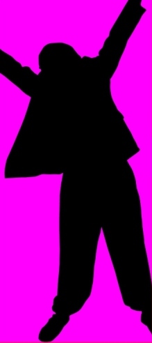
Heidi said she really liked the recurring heart images which clearly was relevant to the song ‘Summer Love.’ She also liked the fact that my silhouette images were referring to the silhouettes that feature in my music video.
Ryan said he too really liked and understood the 80s theme straight away. He appreciated the contrast of the two darker images with the two colourful images and said that all the images fit together nicely.
The only thing that they did query was the difference in text between the far left image (cd holder) and the rest of the images. I explained to them that I wrote out the letters with the torch and said that this image was also going to be a part of my music video. They both appreciated the creative idea and suggested that as long I incorporate all aspects of the digipak such as the cartoons, the silhouettes etc in my music video then the audience will be able to relate to the digipak a lot more and understand what the images are all about.
This is the first image I made for my album digipack. This was inspired by the 80s album cover Make You Shake It by The Human Body (below) and its neon light effects. I too wanted to have a neon light appearance for my album design.
I shot the image in a dark room at night, using a torch to create the light. I decided on 200 ISO and a 10” second exposure at an aperture of f/5.6 – I needed enough time to move into the shot, turn the torch on, point it at the camera and write a letter. This is all not one image. I took separate images of each letter and the heart (the 3 hearts are all the same heart) and then combined them together on one image in Photoshop.
I also changed the colours of the light on Photoshop; I did this by using the ‘Hue’ tool. I also had to edit the heart as I could not draw a perfect heart with the torch (shown below).
All I did was cut this image in half, deleted the wobbly right half, copied the left half, reversed the copied half and then combined it with the original left half, so I ended up with a perfectly symmetrical heart...
I then made three copies of this heart for the final image.
--------
I plan to show more symbolic references to summer in my music video. For example I plan to have occasional shots of someone drinking a colourful cocktail. I would like a picture of a cocktail as part of my album design, as I think this would be a really eye-catching image.
I added some red food colouring to a big glass of water and then added an orange straw and yellow cocktail umbrella. I thought carefully about the colours of everything as I did not want anything clashing. I then placed the drink in front of a plain white sheet of plastic with a strong light behind the sheet. I took lots of images of the drink experimenting with all kinds of angles. However I felt that the pictures were empty and I needed another object in the frame.
I found a glass patterned with a red heart design. I thought this was excellent because not only did the colours go well with the drink, but also the heart design is extremely relevant to the title of the song. I then took more images of the cocktail and heart patterned glass. I took more close-up shots of the design and top of the cocktail. These made quite effective images.
When editing the image, I cropped it so that the dimensions were a square. I then made the image brighter using curves, so that most of the background was just a bright white. I also reversed the image so that the symbolism of summer was on the left and symbolism of love was on the right.
I really liked this image, not just because it looked bright and eye-catching but there is something quite unique about it and I think it would make an effective front cover for the album. Therefore my next step was to put some text on the image – saying the song title and artist’s name.
Red was obviously the colour theme of this image, so I needed to make sure the colour of the text fitted in well. I tried a variety of different shades of red; that ranged from pinks to burgundies. I also had to pick my font carefully – I wanted something fun looking, but still something readable. I originally imagined the Impact font, but I found this far too bold and quite hard to read. I then tried the Jokerman font, but this looked too inappropriate and unreadable. Finally I found the BALLOONIST font and in my opinion this worked perfectly on the image. It is an easily readable font and it does not look too serious or sophisticated.
The image looked great and was very close to how I imagined it to appear. However I found that there was a distracting empty space between the top of the cocktail and beneath the ‘Michael Jameson.’ I did not want to show any more symbolisms of the song title as this would be too much, therefore I decided to fill this space with a few small pictures of the main protagonist in the music video.
Inspired by the Paula Abdul video, Opposites Attract (mentioned in my Inspiration and Ideas for my music video post) and its strong cartoon theme and also inspired by De La Soul’s album, Three Feet High and Rising (below) I wanted a cartoony image as part of my album design.
I imagined having a cartoon character in a typical summery setting – e.g. on the beach on a hot day with a cocktail in his/her hand. He/She wears a hat and some shades. I tried creating this scene on my graphic design programme, Serif Draw Plus but I when I finished it, I did not particularly like it and found the colours did not particularly go well with the other images I had already created.
I then had another idea to make a montage of different cartoons that each suggested summer. For example a cartoon ice cream, palm tree etc. I still had my small cartoon character saved so I used it as part of the montage. I then made various cartoons of a beach ball, ice cream, palm tree, an umbrella in the sand and a sun with a smiley face. I found these cartoons really stood out on a black background and after I was satisfied with all their positions on the black, I then added some small hearts in between them just to fill the gaps. I found two orange hearts and two red hearts went well with the colours of the cartoons and here is how it looks…
For my fourth and final image I wanted to try and create some silhouettes of myself in various dance poses. This idea was inspired by Michael Jackson’s silhouette work in his music videos (I mentioned this in an earlier post) and also the well-known iTunes silhouettes.
Like I did for the front album design, I put my camera on self-timer mode and pulled various different dance poses. Then, when editing the images on Photoshop, I used the lasso tool to carefully draw around my body. Once I had finished this and the lines I drew automatically lit up, I copied and pasted my selection as a new layer on the image. I then deleted the rest of the image, so it was only the copied layer of myself holding a dance pose in the frame. Then using the paint tool, I just painted the layer of me black to give the appearance of a silhouette.
Once I created all of my desired silhouettes using this method, I then imported the images to Serif Draw Plus (simply because I found it easier to work on there) and finished the job on there. I drew out rectangles behind these silhouettes and filled the rectangles with a vibrant colour and then any part of the silhouette that jutted out from the rectangle I cropped, so it looked like this…
I then combined all three silhouettes, using a different and vibrant colour for each rectangle...
I love the appearance of this, however I needed something else as part of this image to make it fit the square dimension of a CD digipak. I simply added a horizontal rectangle at the bottom of the three silhouettes. Then, to fill the blank space of this rectangle I added some hearts and this seemed to work really well…
I then put all these four images together on Photoshop to see if they worked well together.
Though I am pleased with all these images I have created, I do think that my front cover (top left) looks a bit washed out compared to the bold colours in the other images. Therefore I am going to try and think of a new image that would work better.
I also need to adjust one of the images so I can show the track listing for the album. I think I may adjust my cartoon montage and see if I could work in a track listing on there. In my opinion, the silhouette and neon light image look good just as they are and I do not really want to adjust any of them for the track listing.
The last thing I need to do is make a spine for the digipak. Once I have done these last few tasks my digipak should be completed!
I am going to be making an 80s themed pop music video for the song, Summer Love by Michael Jameson (found music on website, Jamendo). For inspiration and ideas I have researched a lot of 80s pop and New Jack Swing music videos from artists such as Bobby Brown, Jane Child, Rick Astley and many more.
Bobby Brown was a very good dancer and in his early music videos, he does a lot of stylish and well choreographed dance routines. I have been looking at his dancing and I myself have started choreographing my own routine inspired by his moves. A typical late 80s/early 90s move was The Running Man (a running action on the spot), which Bobby Brown performs several times in his music video, Every Little Step I Take. Not only do I like Bobby’s moves in the video but I also like the triangle formation he and his dancers are in. I may use this formation in my music video.
I really like how Bobby occasionally comes out from the main dance routine and does some improvised moves, whilst the other two dancers carry on with the routine. I like this because it seems more relaxed then all three of them performing the same routine move by move. It also makes the shot more interesting, otherwise the movement may get a bit boring to watch without Bobby putting his own spin on it.
The editing is very quick and there are a series of shots showing Bobby singing without anyone else on camera. I have noticed that with this footage that the shots vary between this mid-shot of him:-
And this close up shot of him:-
Both are very simple shots, yet the quick editing makes them effective. This is something I that I would probably like to experiment with when it comes to making my music video. It would be good if I could get a variety of close-up, mid and long shots of lip-syncer, as this will give me a lot to work and experiment with.
I also have been watching Jane Child’s music video for I Don’t Want to Fall in Love. A lot of the shots show her walking through the streets of New York in the evening. Though it looks really effective and is a good idea, I want to try and avoid shooting outdoors mainly because of the context of the song. The song I am using is called, Summer Love and because now summer is over, I think shooting outside in the autumn/winter season will look a bit odd and ruin the effect. Therefore, I am perhaps going to have more symbolic references to summer, such as somebody drinking a colourful cocktail or someone chilling in a deck chair wearing shades and a Hawaiian shirt, or I may not need to symbolise summer at all, I will see what I think is appropriate when the time comes.
Towards the beginning of this video, there are some moving shots of a percussionist:-
I think shots similar to this one would be good for my music video, particularly as the song, Summer Love has a good beat to it. I play the drums and own an electric drum kit (which is very 80s), so to have some shots of myself playing the electric drum kit would be really good. I have also imagined some good close-up shots of a single drum being hit by one of the sticks.
Ricky Astley was a very popular artist in the 80s and I have watched several of his music videos. The video I liked in particular was, Together Forever. Similar to the Bobby Brown video, there are a variety of shots showing Rick Astley singing. In between these shots however there are other random people dancing (and not singing), which creates a bit more variety. I like this idea and for my music video I think I will get some people or a person to do a bit of improvised dancing in front of the camera. This will create a good range of shots for me to edit as well as variety amongst the shots of me lip syncing.
I also had the idea of doing some silhouette work for my video. I imagine that I will create both dancer silhouettes and silhouettes of lip-syncing. This was partly inspired by the video I analysed in my earlier post, Trust In Me by Az-1. In this video there are short shots of street dancer silhouettes. However most of my inspiration for making silhouettes has in fact come from Michael Jackson’s music videos. There are several videos of his, where either he and/or others are dancing or lip-syncing to the music in a silhouette. Here are some examples:-
Screen shot from The Way You Make Me Feel (1987)
Screen shot from Jam (1992)
Screen Shot from In The Closet (1992)
Paula Abdul’s video Opposites Attract, shows a reltionship between Paula Abdul and a male cat cartoon character. How the cat is animated in the frame with Paula is clever and it is quite convincing that she is actually reacting and singing with the cartoon figure.
I like the idea of introducing some kind of cartoon element into my video. I would like to make this video quite crazy, off the wall and good fun, so I think introducing cartoon would be quite appropriate to the theme. However if I do show cartoon elements, it would be best to keep it simple. I think trying to create a cartoon character to interact with real people in the video may be quite complex to create.
Above is an amateur video I found on YouTube of someone paying his tributes to Bobby Brown and imitating his moves. This is the style of dancing I want in my music video as it is upbeat and good fun to perform. The style of dance is typical of the late 80s and early 90s (New Jack Swing), which is appropriate for my music video.
I have been watching this video closely and have taught myself some of the movements. I have tried out some of them along with the song, Summer Love and the moves work well.
I loved the use of the neon light environment in Ray Jay Parker’s Ghostbusters music video, as one really gets the sense of the 'artifical 80s.' It would be great if I could add some kind of effect to my footage, that also suggested of an artificial world.
The neon light effect in Ghostbusters music video by Ray Jay Parker (1984)
Below is a New Jack Swing music video, Always Thinking by the short lived band, Aftershock. There are several moments when the lyrics quickly flash up and scroll across the screen. I think this is really effective and I may use this in my own music video if I can.