Monday 22 November 2010

Creating cartoons

I have explained in earlier posts that I may be considering creating cartoon elements for my music video (inspired by Paula Abdul’s music video Opposites Attract), as I have included in my current album digipack and magazine cover.

The small orange hat wearing character that I created for my album digipack, I also want include in my music video. However, in the music video I want to create him appearing to play a horn to illustrate some of the horn motifs in the song.

This is what I achieved on the graphic design programme Serif Draw Plus.8…


As well being influenced by Paula Abdul’s music video, during the creation of this orange character of mine, I was partly inspired by the 80s advert for Kia-Ora (orange juice). The advert is a colourful and wacky cartoon animation.


Um Bongo is another 80s fruit juice drink with a similar advert.


I have also created a short animation of cartoon musical notes appearing on screen in time to the horn played in the song.


Sunday 21 November 2010

Creating an animation


Here is the first animation I made for my music video. For my first shoot (as explained in my shot list post) I want to have my neon light picture from my digipack showing and when the music starts the camera appears to zoom into the blackness of the image.
Here I have made my first shot using the animation programme Serif Draw Plus. I have purposely made the animation a little jerky and wobbly, as it suits the quirky, upbeat theme of my music video. I myself am pleased with it and hopefully it will look great in my music video.

Thursday 4 November 2010

Feedback on Digipak from members of my target audience


Ryan's and Heidi's comments were useful, however after researching into my target audience,  I needed to get feedback from members of my actual target audience.

Therefore, I showed a few of my peers, who are like myself and are big fans of the 80s. These were two white teenage girls (Claire and Michelle), who in particular love Madonna, Rick Astley and Paula Abdul and one black teenage boy (Nathan) who prefers the New Jack Swing genre more, however is a huge fan of the 80s hits from Michael Jackson and Kid Creole and The Coconuts.

All of them said the vibrant colours on the front and inside cover were typical of the 80s and very eye catching. They also liked the use of the threshold effect which gave it a retro look and the use of Andy Warhol’s idea of the 3x3 square template. They also liked the neon light design I created placed on the inside.

However, they did say that there was still quite an amateur feel to it and they honestly admitted that they probably would not buy if it were on sale. Nathan suggested that perhaps I should re-consider putting the neon light design on my front cover as he thought it was a stunning image and it needed to be shown off. Michelle and Claire agreed with this.

Michelle said that she thought it was the back cover’s cartoon design just did not look right with the other images and she suggested that perhaps I should abandon the cartoons altogether.

This was some really valid feedback. It was important that I heard this from members of my target audience, as after I need to make my products marketable. I will make improvements on my digipak according to this feedback in the future.


Wednesday 3 November 2010

Target AUDIENCE etc

The artificial, colourful 80s genre of my music video is different from the mainstream music videos we are seeing today. However, after doing my research, I have realised that I have elements in my music video that are not dissimilar to some modern and popular music videos.

Popular artists such as N-Dubz and JLS have tended to use more naturalistic colours in their music videos. However, I have found in some of their videos; the mise en scene is very surreal and unnatural and not dissimilar to the effect I am trying to achieve in my music video.

For example in JLS’ music video, Eyes Wide Shut, the group sing and dance in a heaven-like world. They are upon what seems to be a platform high up in the sky with many clouds in the background. There is a light brown/red filter on the camera giving the mise-en-scene a warm, comforting feel.
Screen shot from JLS' Eyes Wide Shut music video
I think music videos like this, which represent difference and a sense of ‘escaping the natural world’ gain more interest from audiences. Although I do not have the skills to create the amazing surreal world of Eyes Wide Shut, I am taking a similar approach with the use of the ‘threshold’ effect and bright colours to create an unnatural world in my video.

The use of the fantasy-like environment in Eyes Wide Shut is significantly symbolic and appropriate to the song. However, the colour effects I am using in my music video have really no symbolic elements, but they are relevant to the 80s genre and both visually powerful and entertaining. 

N Dubz’ music video for the song Took It All Away uses the popular Playstation 3 game, Little Big Planet (LBP) as their environment throughout the whole song. Each band member has their own LBP avatar created to resemble their real life appearance. The video is like a 3D cartoon animation.
Screen shot from N-Dubz' Took It All Away music video
I am considering adding elements of cartoon animation in my music video (originally inspired by the 80s music video Opposites Attract by Paula Abdul), because I think it is a creative and imaginative way of entering an unnatural world.

The reason I have looked at music videos by JLS and N-Dubz is that they have been considered as the modern ‘New Jack Swing.’  The New Jack Swing was the new black music genre of the late 80s/early 90s. Before its time, RnB and Hip Hop music were considered as two separate genres and songs would fit either in one or the other. However, the New Jack Swing combined these two genres, so songs would begin to have heavy hip hop beats with RnB/Soul vocals over the top. Some New Jack Swing songs had rapping in as well. 

My music video has got the typical colourful 80s appearance to it, however there are heavy influences of the New Jack Swing in it as well, such as the dancing (inspired by Bobby Brown ‘The King of New Jack Swing) and the costumes (partly inspired by New Jack Swing artists, MC Hammer and Guy). Also the track of ‘Summer Love’ is very typical of the New Jack Swing genre.
The people who like the urban artists of today (such as N-Dubz and JLS who combine RnB and Hip Hop together in their music) are likely to be part of my target audience. These people will most probably be young black males aged 15-25. Young black females of around the same age are likely to appreciate similar music, but they will probably be more attracted to the ‘boy bands’ such as JLS. The ‘boy band’ image is something that is not apparent in my music video.

People who appreciated the music of the New Jack Swing era will also be part of my target audience. These are likely to be black youths (both male and female) of the time who are now aged around 30-40.
Popular New Jack Swing artists

Because of the 80s influences, as well as the New Jack Swing influences, in my music video, people who appreciated the synthesizing, manufactured sound of the 80s are also likely to be part of my target audience. The track ‘Summer Love’ is very much in the New Jack Swing style and there are clear 80s influences apparent in the song.

People who like the music of Rick Astley, Paula Abdul, Madonna and Queen (although they were more ‘pop rock,’ their worldwide successful song in 1984, Radio Gaga was mimicking the 80s sound), are also likely to be part of my target audience. These artists’ style was very pop-like and because of the genre, the music probably appealed more to a white audience. Michael Jackson was one of the few black artists of the 80s who really entered the pop genre in his music; however he still attracted largely a white audience. This group of people are likely to have been teens in the 80s, therefore are probably now aged around 35-45. However, I think this particular group of people will be more female dominated, as a lot of women were head over heels in love with both Rick Astley and Michael Jackson and also a lot of them were heavily influenced by the style of Paula Abdul and Madonna.

Queen's Radio Gaga
Finally, people who are now in their teenage years and appreciate ‘retro’ music (like myself) are also going to be part of my target audience. I discovered a lot of 80s and New Jack Swing hits from the incredibly popular Playstation 2 games Grand Theft Auto: Vice City (GTAVC) and Grand Theft Auto: San Andreas (GTASA).

GTA: Vice City fictional Radio Presenters
GTAVC is set in early 80s Miami. Nearly all the vehicles you can drive in the game have a radio, and the player can choose from nine radio stations to listen to. The music of course is all hits of the early 80s, from artists such as Queen, Michael Jackson, Kool and the Gang etc. From various forums on the Internet, I have discovered that a lot of young people in my age range have grown fond of 80s music due to GTAVC.

I also grew fond of the New Jack Swing from GTASA. The fictional radio station, CSR 103.2 on the game is dedicated to the New Jack Swing, and plays songs from artists such as Bobby Brown, Guy and Boyz II Men. This too will have undoubtedly had some influence on the music tastes of the young people playing this game.

GTA: San Andreas' fictional Radio Stations


Tuesday 2 November 2010

Costume Research

Here are some images of the 80s and New Jack Swing fashions that have helped me choose the costumes for my music video.

Monday 1 November 2010

Music Video Animatic and Shot List


Shot 1 – Summer Love neon light picture, music begins and the camera zooms into blackness.
Shot 2 – Zooms out of the blackness to reveal a close up shot of en electric drum kit – we see the hands playing the drum kit.
Shot 3 – Close up side shot of main protagonist tugging their jacket collar
Shot 4 – Close up of feet tapping to the beat
Shot 5 – Close up of hand tapping the side of their leg
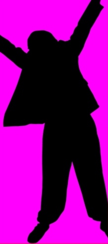
Shot 6 – Silhouetted dancer doing a move
Shot 7 – An animation of music notes appearing to the beat of the horn
Shot 8 – Tracking shot from behind the drummer
Shot 9 – Animation of cartoon dancers doing moves to the beat of the horns
Shot 10 – Long shot of dancer pulling a move
Shot 11 – Split screen – Left: Long shot of three dancers performing the routine. Right: Close-Up of Protagonist lip syncing to words
Shot 12 – Mid –shot of protagonist lip syncing
Shot 13 – Long shot of three dancers
Shot 14 – Split screen again
Shot 15 –Moving shot of protagonist lip-syncing
Shot 16 – Close Up of a random person (probably one of the dancers) taking a sip from a colourful looking cocktail
Shot 17 – Long shot of three dancers (from the side)
Shot 18 – Long Shot of dancers (from the front)
Shot 19 – Close up of an eye opening up
Shot 20 – Girl with cocktail winking at the camera
Shot 21 – Close-Up of somebody dressed up in summer gear over doing the lip-syncing
Shot 22 – Dynamic moving shot of the drummer
Shot 23 – Summer gear dressed person having a smile (close-up)
Shot 24 – Long shot of two silhouettes pulling a move
Shot 25 – Close – up of foot tap
Shot 26 – Close – Up of someone pulling down some shades
Shot 27 – Long shot of solo silhouette doing a fancy move
Shot 28 – Mid shot of protagonist lip syncing
Shot 29 – Front and long shot of three dancers
Shot 30 – Moving shot of drummer
Shot 31 – Long shot of someone doing a cool move
Shot 32 – Front and long shot of three dancers
Shot 33 - Long shot of someone doing a cool move
Shot 34 – Close up of a girl blowing a kiss to the camera
Shot 35 – Shot of colourful cocktail surrounded by fruit
Shot 36 – Shot of girl drinking cocktail
Shot 37 – Close up of someone laughing at camera
Shot 38 – Shot of dancing feet
Shot 39 – Side silhouette of someone lip syncing
Shot 40 – Mid-long shot of someone with lyrics appearing at their side
Shot 41 – Mid shot of the person shrugging, the lyrics have disappeared
Shot 42 – Angled (Tilt) shot of three dancers
Shot 43 – Once again side shot of silhouette lip-syncing
Shot 44 – Shot of dancing feet
Shot 45 – Angled (Tilt) shot of three dancers
Shot 46 – Close up of eyes putting on shades
Shot 47 – Animation of moving with words saying, ‘They know it’s time for…’
Shot 48 – Slow motion – hands come together to make a heart shape
Shot 49 – Split screen once again of dancers and protagonist lip syncing
Shot 50 – Close up of protagonist lip syncing
Shot 51 – Numerous shots fill up the screen and then ‘Summer Love’ appears in the middle of the screen
Shot 52 – Shot of dancing feet
Shot 53 – Side silhouette lip syncing
Shot 54 – Long shot of dancing silhouette
Shot 55 – side silhouette lip syncing
Shot 56 – Moving shot of drummer
Shot 57 – Long shot of drummer not playing drum kit – just posing
Shot 58 – Close up of protagonist lip syncing
Shot 59 – Lyrics appear on screen
Shot 60 – Mid long shot of someone lip-syncing
Shot 61 – Close up of funky writing on piece of paper
Shot 62 – Close up of summer dressed person lip syncing
Shot 63 – Animation of the lyrics ‘It’s a blast’
Shot 64 – Long shot of someone doing a cartwheel
Shot 65 – Mid shot of someone nodding their head to the beat
Shot 66 – Close Up of dancing silhouette
Shot 67 – Close Up of drummer playing
Shot 68 – Close Up of protagonist lip syncing
Shot 69 – Long shot of someone lying down on a deck chair raising a glass
Shot 70 – Mid close up of protagonist lip syncing
Shot 71 – Close up of silhouette lip syncing
Shot 72 – Close up of one of the three dancers
Shot 73 – Mid long shot of someone doing over the top dancing and lip syncing
Shot 74 – Lyrics appearing on screen
Shot 75 – Long shot of silhouette holding a pose
Shot 76 – Moving shot of drummer
Shot 77 – Mid shot of someone lying in the deck chair looking chilled
Shot 78 – Extreme close up of someone laughing
Shot 79 – Extreme close up of protagonist lip syncing
Shot 80 – Mid long shot of three dancers
Shot 81 – Moving shot of protagonist lip syncing
Shot 82 – Close up of hands playing drums
Shot 83 – Close up of hand tapping side of leg
Shot 84 – Long shot of dancer
Shot 85 – Long shot of silhouette dancer
Shot 86 – Animation shot of musical notes
Shot 87 – Moving shot of protagonist lip syncing
Shot 88 – Close up of girl blowing a kiss
Shot 89 – Close of foot tapping to the beat
Shot 90 – Moving shot of protagonist lip syncing
Shot 91 – Close up of deck chair person chilling
Shot 92 – Moving shot of drummer
Shot 93 – Shot of dancers feet
Shot 94 – Close up of protagonist lip syncing
Shot 95 – Multiple, random shots appear on screen to the beat
Shot 96 – Long shot of drummer
Shot 97 – Mid long shot of silhouette dancer
Shot 98 – Mid-long shot of drummer
Shot 99 – Close up of three dancers
Shot 100 – Long shot of three dancers disappearing and fading at random places on screen to the beat of the music
Shot 101 – Picture of the album image
Shot 102 – close up of hand tapping against the side of the leg
Shot 103 – Long shot of silhouette dancer
Shot 104 – Shot of foot tapping to beat
Shot 105 – close of hands playing drums
Shot 106 – Tracking shot of drummer
Shot 107 – From the side, long shot of dancers
Shot 108 – Close up of hand holding cocktail
Shot 109 – Close up of summer dressed person
Shot 110 – Close up of fruit
Shot 111 – Animation of people dancing
Shot 112 – Long shot of dancer
Shot 113 – Mid shot of protagonist lip syncing
Shot 114 – Split screen of protagonist and dancers
Shot 115 – Mid shot of two silhouettes posing
Shot 116 – Moving shot of protagonist lip syncing
Shot 117 – Long shot of three dancers

Monday 25 October 2010

Preliminary Exercise (Lip Sync Practice)


Here is a quick video I made with my webcam, which explains why it is not top quality. I recorded myself singing along to Bobby Brown’s Every Little Step. Then when it came to editing this footage I muted the clip and added the audio mp3 file along with the video file. It was quite a challenge at first to get my lip syncing in time with the music, as this is the first time I have edited since the AS course. However I eventually got everything in time, and this has increased my confidence when it comes to edit my footage for my actual music video.

As well as lip syncing, I also plan to have dance routines and shots of a drummer, this also will need to be in time with the music. Therefore, it is vital that I have some practice with editing footage before I get to the real thing.  

I chose the song from Bobby Brown because not only is it one of my favourites, but it also gets me in the mood for my 80s themed music video!

Thursday 21 October 2010

Feedback on my digipak

I received feedback from my peers on my digipak and the majority of it was very positive. They said that I really captured the cheesy and vibrant 80s theme in each of the images. They also commented that they could tell that my music video was not to be taken too seriously as the cartoon pictures suggested comic and light hearted themes.
Heidi said she really liked the recurring heart images which clearly was relevant to the song ‘Summer Love.’ She also liked the fact that my silhouette images were referring to the silhouettes that feature in my music video.
Ryan said he too really liked and understood the 80s theme straight away. He appreciated the contrast of the two darker images with the two colourful images and said that all the images fit together nicely.
The only thing that they did query was the difference in text between the far left image (cd holder) and the rest of the images. I explained to them that I wrote out the letters with the torch and said that this image was also going to be a part of my music video. They both appreciated the creative idea and suggested that as long I incorporate all aspects of the digipak such as the cartoons, the silhouettes etc in my music video then the audience will be able to relate to the digipak a lot more and understand what the images are all about.

Saturday 16 October 2010

Making my album digipack 2


Whilst doing some artists research for my Photography course, I stumbled across the artist, Andy Warhol, who is most famously known for making pop-art. One of his most famous images is Marilyn Monroe…

The bold colours and style of pop-art is particularly striking and Andy Warhol’s piece has inspired me to create some pop-art for my own CD digipack. I think using pop-art for my front cover will be extremely eye-catching and unique.

Like Andy Warhol’s piece, I plan to make numerous images for the cover but each picture will be in different colours. However I want to have either a row or column of the same image in the pop-art style but then have a different image for the next row/column. Though the Marilyn Monroe piece is fantastic, I do not want the same image shown nine times – I think it may be a little cliché and look too much like I am trying to copy Andy Warhol.

Inspiration of the pop art style also came from Madonna’s album, Celebration. It is a greatest hits album that collaborates her best songs, several of them being from the 80s decade, therefore the whole concept of the album’s design was to give it a retro appearance, so her fans could identify with the kind of songs included on the CD.
In my old front cover, I portrayed three things a cocktail (symbolising summer), a heart design (symbolising love) and the main protagonist of the music video. For my new pop-art styled album cover, I will show the same three things. I will create images of each of these, and then on Photoshop I will edit them in the pop-art style.

I quickly made a red-coloured cocktail and added a small umbrella to the drink. I once again took pictures of it, but this time I did not worry so much about the lighting, however I did make sure I had a white background and white surface to place the drink on, which I will explain the importance of a bit later. In my already made silhouette image I used the bold colours of magenta, orange and yellow and I will use this same colour scheme for these images.

I bought a photography magazine a while ago, which I still posses, and it included a tutorial on how to make pop-art. Though the tutorial was purposely made for a more advanced version of Photoshop, I still managed to work it out on my simpler version of the programme.

Once I had opened up one of my cocktail images into Photoshop, I went to the ‘Layers’ tab and from there went to ‘New Adjustment Layer’ and then finally clicked ‘Threshold.’ This gave the image a very heavy and grainy black and white effect like this…

If I had used a darker background and surface, they would have turned black which would have hid the cocktail completely. This is why I had to make sure the backdrop was white (the tutorial advised me on this).

I then went to the ‘Layers’ tab and this time selected ‘Create a New Layer.’ It then gave me the option to change the blending mode of the layer and I changed it to ‘Multiply.’ It was then up to me to choose the colours that I wanted for the pop art image and paint over it. Using the paint tool and making sure, the ‘Multiply layer’ was selected in the layer tool bar, I coloured the liquid red and the umbrella yellow. I then made the background pink…


For the other two images, I simple just painted over the pink background to get my desired orange and yellow background…


I then took a few pictures of my face (main protagonist of the music video). I attempted to smile and look happy as I want the fun loving feel of my music video to be portrayed in this digipack design. I chose the happiest looking image and transformed it into pop art on Photoshop using the same technique as I did with the image of the cocktail. Here are the three images…


As you can see I also put on my backwards beret just to add to the 80s feel. I then made an extremely simple heart design on Serif Draw Plus…


I exported the design as a JPEG file so I could use the file in Photoshop and make it into pop-art. I also did some cropping of these images just to make them look a bit better. Here are the final three images of the heart….


I then combined these nine images into one frame in Photoshop. I had to crop the cocktail images quite a bit, so they could fit, however in my opinion they still remain effective…

I then, of course, added in the album title and artist. I once used the Balloonist SF font and made the text white so it stood out from the bold colours. The positioning of the text was inspired by Michael Jackson’s Bad Album (see below). This was simply because Michael Jameson and Michael Jackson are very similar names. This is what probably spurred me to imagine the name ‘Michael Jameson’ to be on its side like ‘Michael Jackson’ is on the Bad album cover.


------
Originally my cartoon montage image looked like this…


However now I have changed it slightly by moving the cartoons around in the frame, in order to make room for the track listing. Basically the track titles I have chosen are from Michael Jameson’s actual Summer Love album. All of the tracks are copyright free, so I am entitled to use their titles for my design.

I also added a barcode onto the image, as I realised after looking at past examples of digipacks from A2 media students, all of them had barcodes on the back image. So I quickly made my own barcode on Serif and added this to the image. In order to fill a bit more space I used the same silhouettes from my silhouette image and placed them on top the barcode and this looked quite effective. I also changed the silhouettes’ colours so they stood out from the black background…
-------

The final task I had to do was to make a spine for the digipack. I looked up some of the information about Michael Jameson’s music on Jamendo and found out that all the songs on the Summer Love album were in fact written and produced by a man called Louis Chiaffarano. I have been looking at the many albums from my own CD collection and have realised that many of them have the producer’s or record label’s name on the spine – this is usually in much smaller text next to the album name and artist.

I will do this for my own spine. I obviously shall have ‘Summer Love’ and ‘Michael Jameson’ written on it, but I will also show the name ‘Louis Chiaffarano’ as a tribute to the producer of the album.

I decided to go for a very simple black background and white text for the spine. I did not want to make it too loud in colour as I think there are plenty of bold colours to be seen in the other images of the digipack.


Monday 11 October 2010

Making my album digipack


This is the first image I made for my album digipack. This was inspired by the 80s album cover Make You Shake It by The Human Body (below) and its neon light effects. I too wanted to have a neon light appearance for my album design.

I shot the image in a dark room at night, using a torch to create the light. I decided on 200 ISO and a 10” second exposure at an aperture of f/5.6 – I needed enough time to move into the shot, turn the torch on, point it at the camera and write a letter. This is all not one image. I took separate images of each letter and the heart (the 3 hearts are all the same heart) and then combined them together on one image in Photoshop.


I also changed the colours of the light on Photoshop; I did this by using the ‘Hue’ tool. I also had to edit the heart as I could not draw a perfect heart with the torch (shown below).


All I did was cut this image in half, deleted the wobbly right half, copied the left half, reversed the copied half and then combined it with the original left half, so I ended up with a perfectly symmetrical heart...


I then made three copies of this heart for the final image.

--------

I plan to show more symbolic references to summer in my music video. For example I plan to have occasional shots of someone drinking a colourful cocktail. I would like a picture of a cocktail as part of my album design, as I think this would be a really eye-catching image.

I added some red food colouring to a big glass of water and then added an orange straw and yellow cocktail umbrella. I thought carefully about the colours of everything as I did not want anything clashing. I then placed the drink in front of a plain white sheet of plastic with a strong light behind the sheet. I took lots of images of the drink experimenting with all kinds of angles. However I felt that the pictures were empty and I needed another object in the frame.

I found a glass patterned with a red heart design. I thought this was excellent because not only did the colours go well with the drink, but also the heart design is extremely relevant to the title of the song. I then took more images of the cocktail and heart patterned glass. I took more close-up shots of the design and top of the cocktail. These made quite effective images.


When editing the image, I cropped it so that the dimensions were a square. I then made the image brighter using curves, so that most of the background was just a bright white. I also reversed the image so that the symbolism of summer was on the left and symbolism of love was on the right.

I really liked this image, not just because it looked bright and eye-catching but there is something quite unique about it and I think it would make an effective front cover for the album. Therefore my next step was to put some text on the image – saying the song title and artist’s name.  

Red was obviously the colour theme of this image, so I needed to make sure the colour of the text fitted in well. I tried a variety of different shades of red; that ranged from pinks to burgundies. I also had to pick my font carefully – I wanted something fun looking, but still something readable. I originally imagined the Impact font, but I found this far too bold and quite hard to read. I then tried the Jokerman font, but this looked too inappropriate and unreadable. Finally I found the BALLOONIST font and in my opinion this worked perfectly on the image. It is an easily readable font and it does not look too serious or sophisticated.

The image looked great and was very close to how I imagined it to appear. However I found that there was a distracting empty space between the top of the cocktail and beneath the ‘Michael Jameson.’ I did not want to show any more symbolisms of the song title as this would be too much, therefore I decided to fill this space with a few small pictures of the main protagonist in the music video.

Inspired by the Paula Abdul video, Opposites Attract (mentioned in my Inspiration and Ideas for my music video post) and its strong cartoon theme and also inspired by De La Soul’s album, Three Feet High and Rising (below) I wanted a cartoony image as part of my album design.
I imagined having a cartoon character in a typical summery setting – e.g. on the beach on a hot day with a cocktail in his/her hand. He/She wears a hat and some shades. I tried creating this scene on my graphic design programme, Serif Draw Plus but I when I finished it, I did not particularly like it and found the colours did not particularly go well with the other images I had already created.


I then had another idea to make a montage of different cartoons that each suggested summer. For example a cartoon ice cream, palm tree etc. I still had my small cartoon character saved so I used it as part of the montage. I then made various cartoons of a beach ball, ice cream, palm tree, an umbrella in the sand and a sun with a smiley face. I found these cartoons really stood out on a black background and after I was satisfied with all their positions on the black, I then added some small hearts in between them just to fill the gaps. I found two orange hearts and two red hearts went well with the colours of the cartoons and here is how it looks…


For my fourth and final image I wanted to try and create some silhouettes of myself in various dance poses. This idea was inspired by Michael Jackson’s silhouette work in his music videos (I mentioned this in an earlier post) and also the well-known iTunes silhouettes.

Like I did for the front album design, I put my camera on self-timer mode and pulled various different dance poses. Then, when editing the images on Photoshop, I used the lasso tool to carefully draw around my body. Once I had finished this and the lines I drew automatically lit up, I copied and pasted my selection as a new layer on the image. I then deleted the rest of the image, so it was only the copied layer of myself holding a dance pose in the frame. Then using the paint tool, I just painted the layer of me black to give the appearance of a silhouette.

Once I created all of my desired silhouettes using this method, I then imported the images to Serif Draw Plus (simply because I found it easier to work on there) and finished the job on there. I drew out rectangles behind these silhouettes and filled the rectangles with a vibrant colour and then any part of the silhouette that jutted out from the rectangle I cropped, so it looked like this…

I then combined all three silhouettes, using a different and vibrant colour for each rectangle...

I love the appearance of this, however I needed something else as part of this image to make it fit the square dimension of a CD digipak. I simply added a horizontal rectangle at the bottom of the three silhouettes. Then, to fill the blank space of this rectangle I added some hearts and this seemed to work really well…


I then put all these four images together on Photoshop to see if they worked well together.

Though I am pleased with all these images I have created, I do think that my front cover (top left) looks a bit washed out compared to the bold colours in the other images. Therefore I am going to try and think of a new image that would work better.

I also need to adjust one of the images so I can show the track listing for the album. I think I may adjust my cartoon montage and see if I could work in a track listing on there. In my opinion, the silhouette and neon light image look good just as they are and I do not really want to adjust any of them for the track listing.

The last thing I need to do is make a spine for the digipak. Once I have done these last few tasks my digipak should be completed!